Branding
Customize AuthKit to fit natively with your app’s unique design.
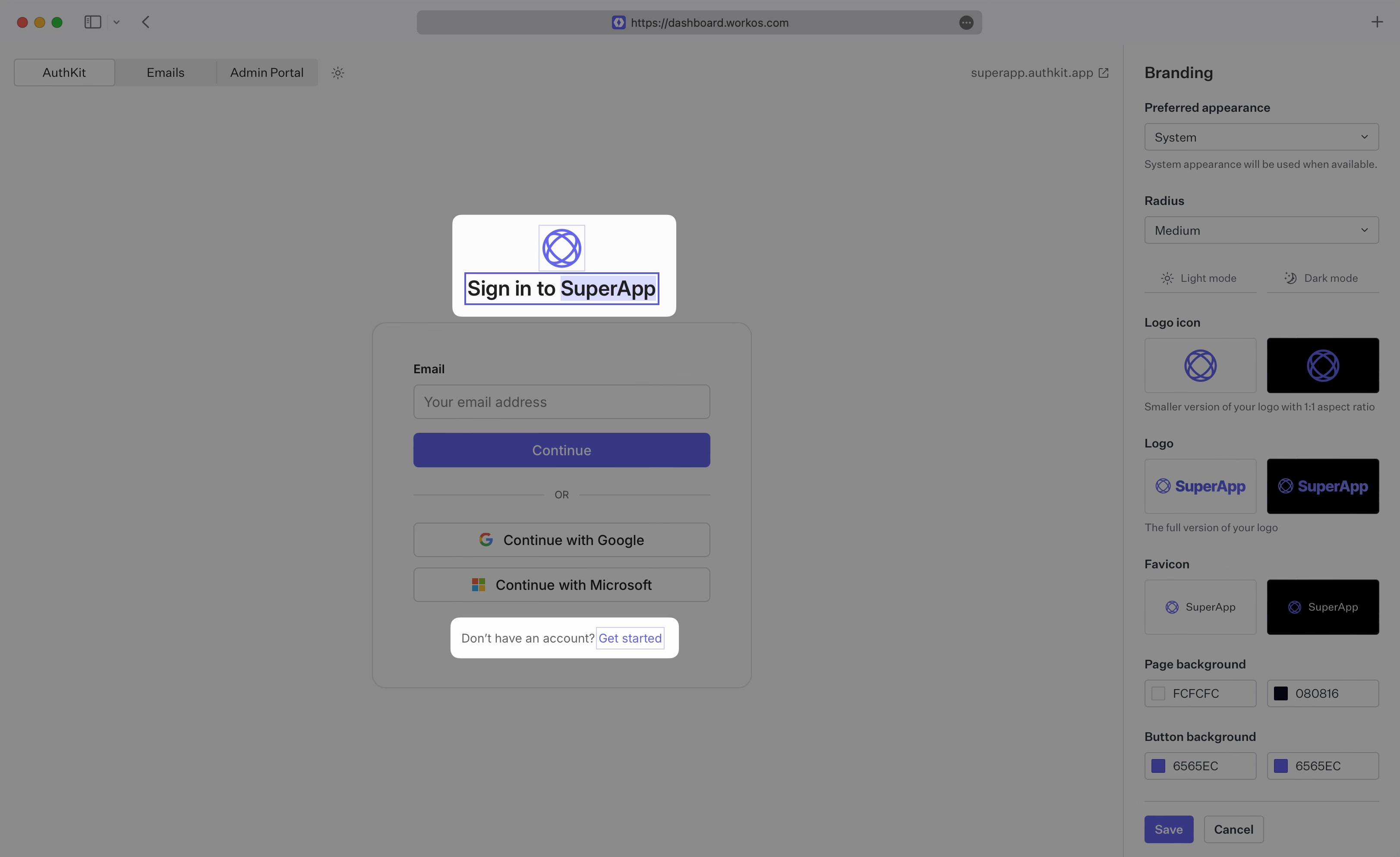
You can customize the look and feel of AuthKit via the Branding section of the WorkOS Dashboard.
The brand editor allows you to:
- Upload logos and favicons
- Set brand colors for buttons, links, and backgrounds
- Manage visual properties such as corner radius and dark mode appearance
The AuthKit preview will update in real-time as you make changes and accurately reflect the available authentication methods, giving you a clear picture of the authentication experience with AuthKit.
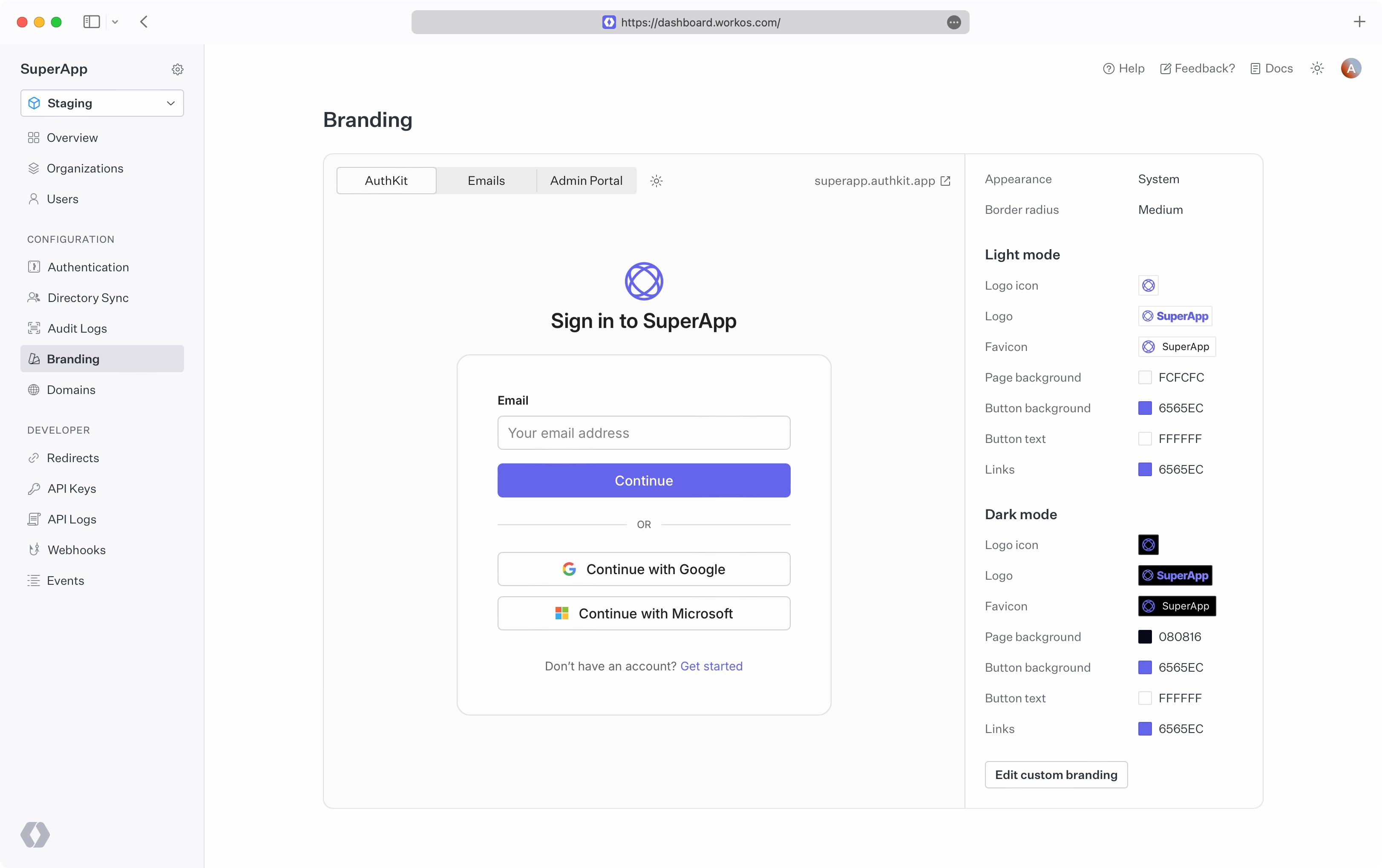
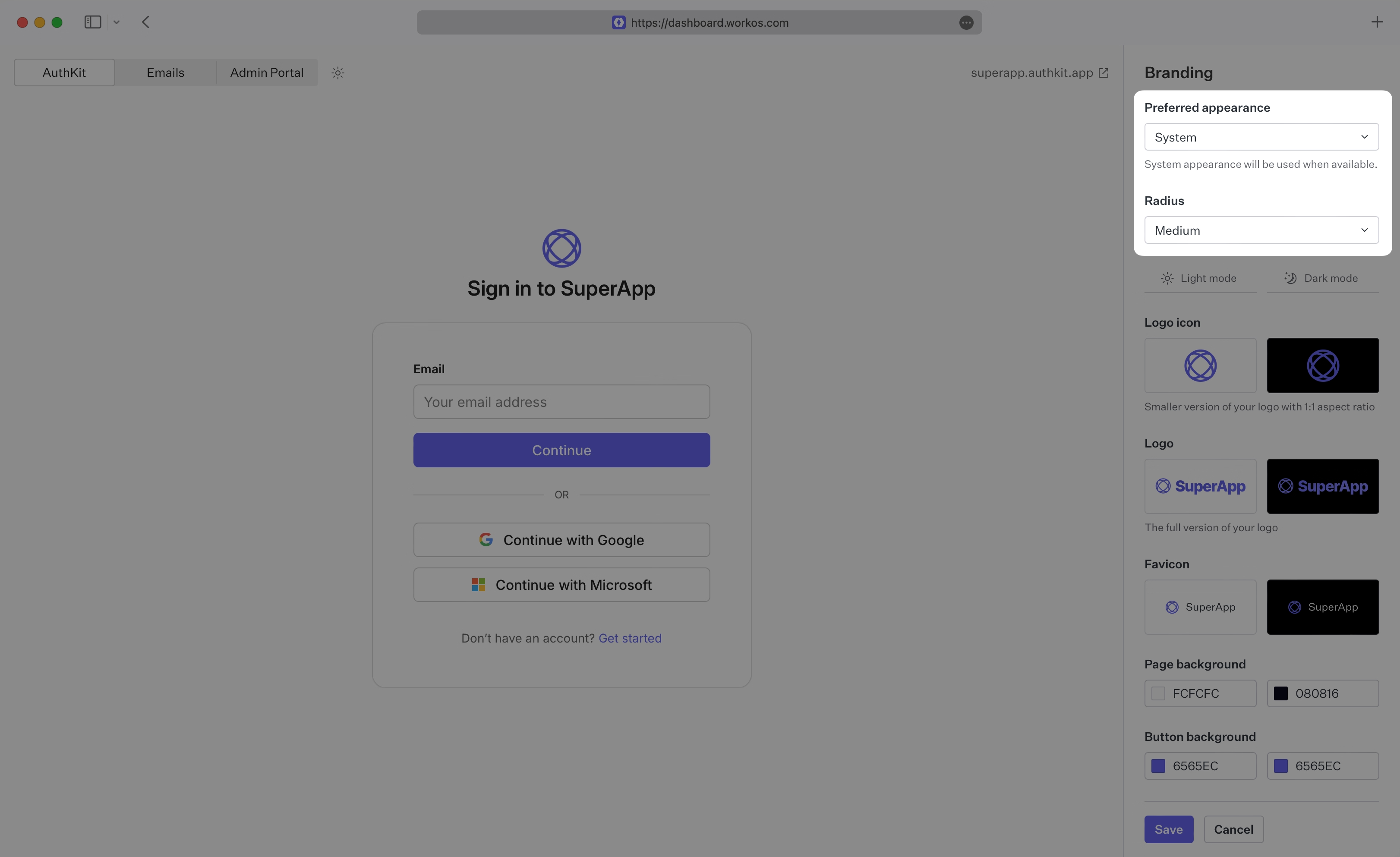
AuthKit supports both light and dark mode; each brand configuration option is split across both so that they can be configured independently. You can enforce a specific appearance, or allow the user's OS system settings to determine which to use.
The corner radius applied to UI elements can also be configured; a lower value will result in a more formal aesthetic while a higher value has a more rounded, playful feel.
You can upload custom brand assets to display in AuthKit, transactional emails, and the Admin Portal.
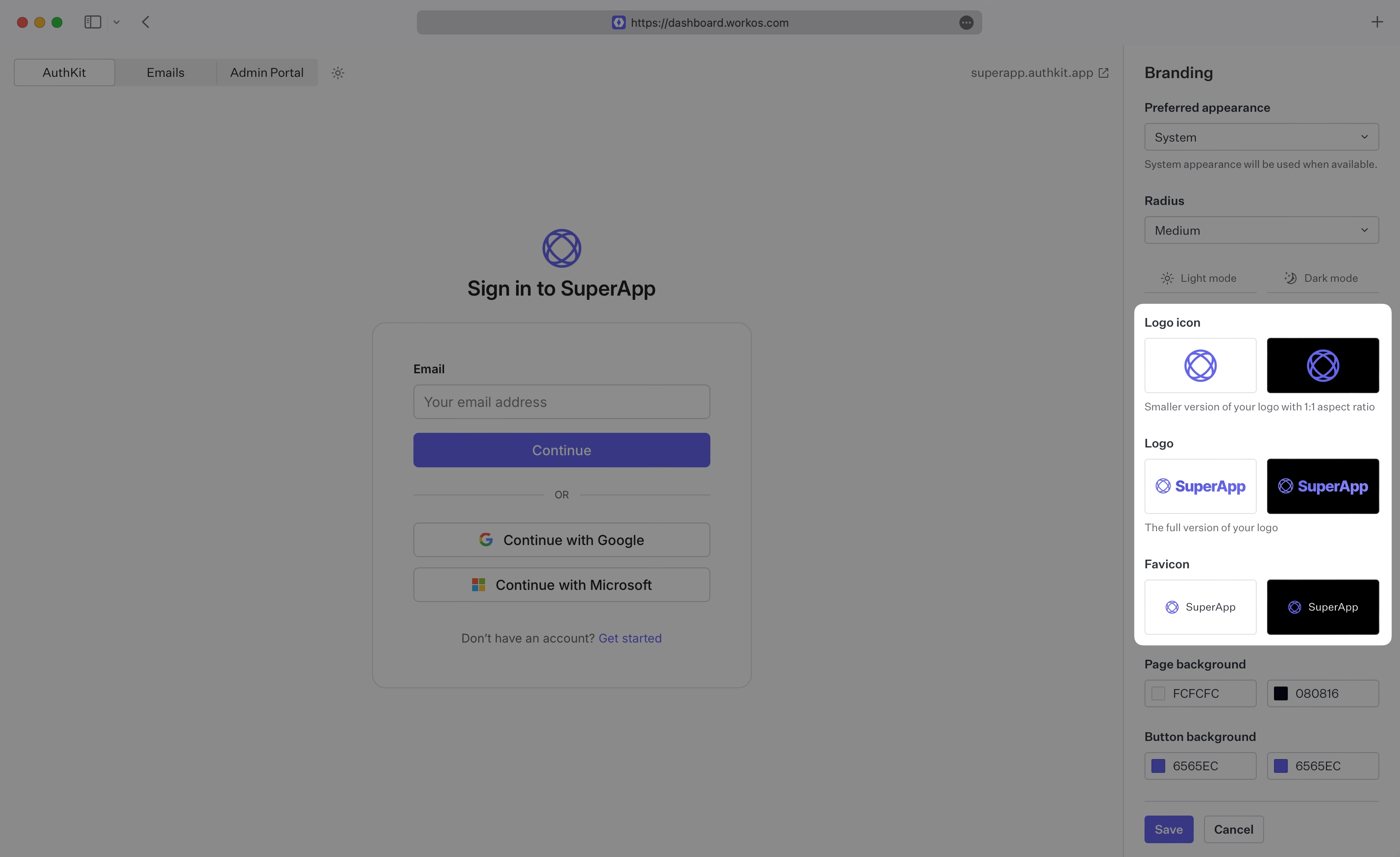
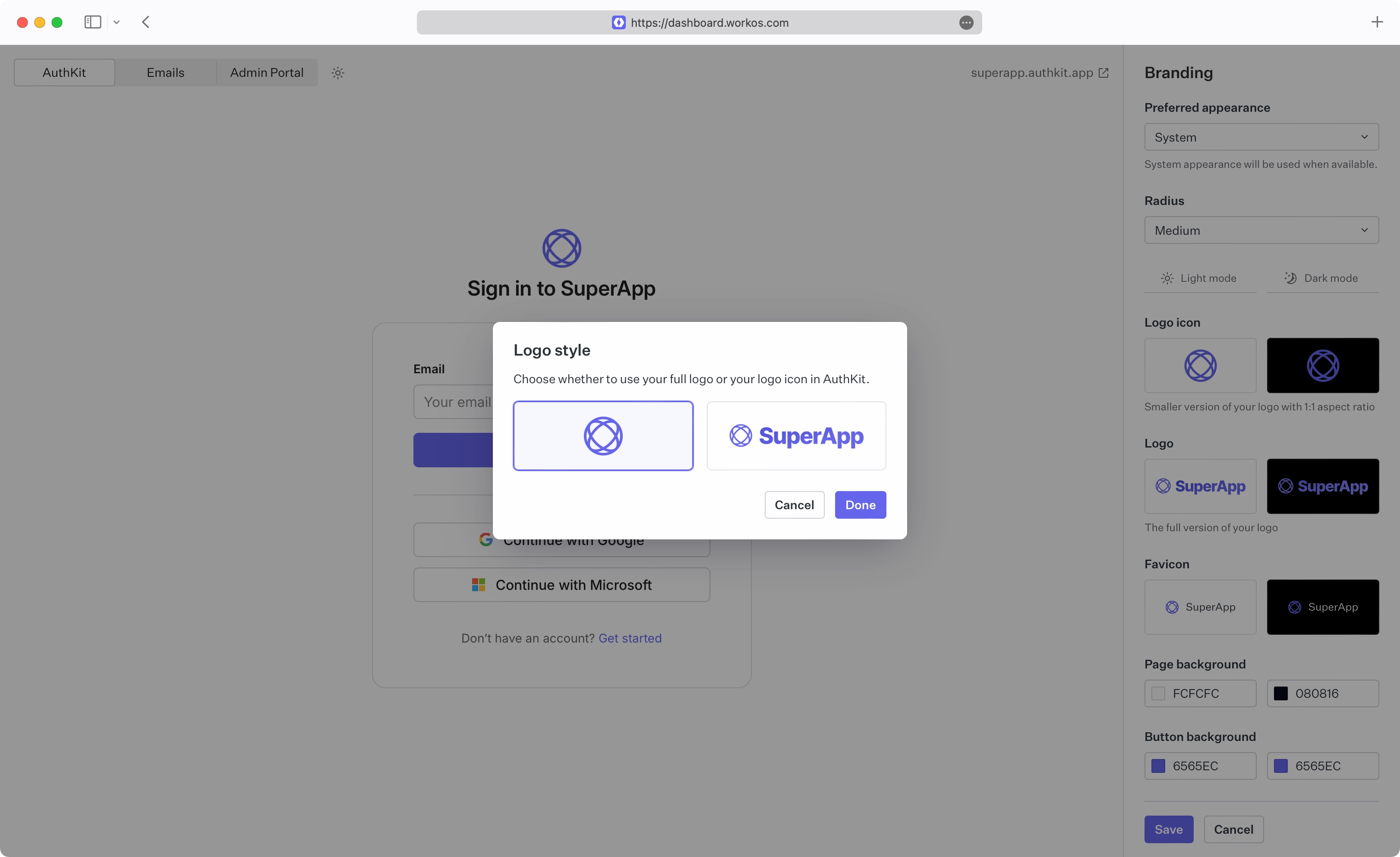
There are three types of uploadable assets:
- Logo: Your full size brand logo, styles vary but this would typically include the wordmark.
- Logo icon: A smaller, iconized version of the logo, this is often simply the logomark.
- Favicon: The favicon is displayed in the browser tab alongside the address bar.
Either the logo or the logo icon can be displayed in AuthKit. To select which to use, click the logo in the AuthKit preview after uploading both assets.
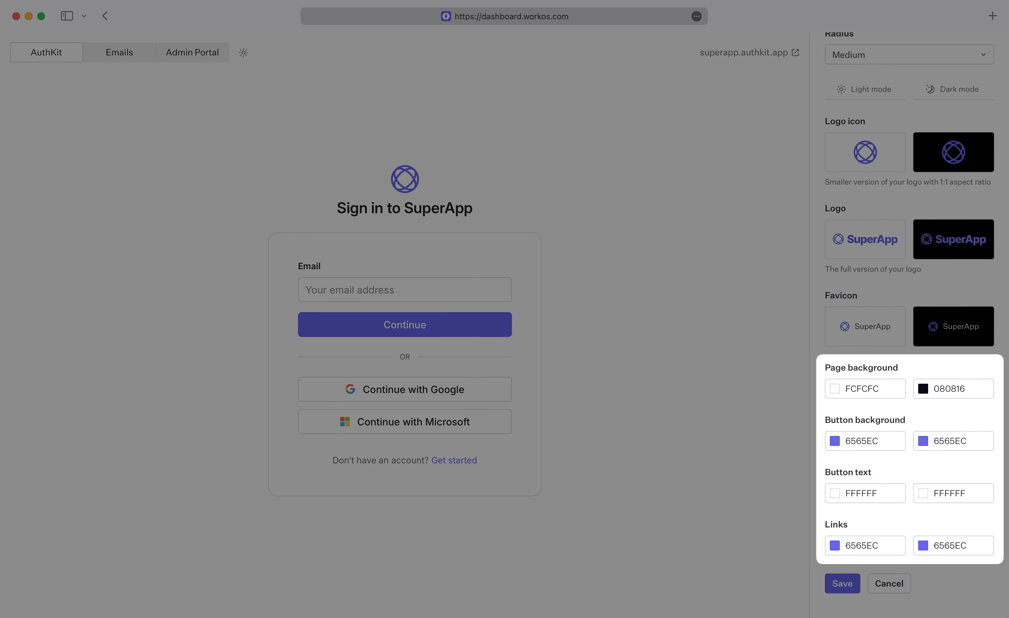
You can control four colors across light and dark mode:
- Page background color
- Button background colors
- Button text color
- Link color
Other colors used in the UI, like the focus outline, hover styles, or borders, are created automatically based on the four colors you provide, ensuring a consistent look and feel.
The sign-in page title and sign-up link text in AuthKit can be customized to fit your brand’s tone of voice. They can be edited directly inside the AuthKit preview pane.